Showing posts with label pair a phrase. Show all posts

Friday, July 20, 2012

Nothing like arrival...

... Of new products to get you revved up again and your creative juices flowing. The new catalog has been released to consultants and will be rolled out to everyone else Aug. 1. There are a lot of gorgeous new stamps, and my favorite two new things yet - a workshop to go geared towards making cards alongside the popular scrapbooking workshop to go, and a brand new Cricut cartridge! I can't wait! My mom's birthday is coming up next month and my sister in law is visiting, so posts next month may be sporadic but time will also be precious.

Want to see what's in Artiste - the new cartridge? Provocraft has just released the digital handbook for a peek!

The inspiration for this week's card is from Got Sketch : Sketch 145.

I just found out that I can't upload images from my iPad to the blog (or even to Facebook). Boo to the fact that Flash is not supported on Apple mobile devices.


I took this opportunity to check out some of the special effects that the iPad Adobe Photoshop app has. Kind of neat, but lacks the entire force of what you can do with the full package. I also wasn't able to watermark the images. I combined two paper packs here - Stella and Florentine and the border with the rhinestones is the back side of Florentine.

The ribbon is sourced from Crave Cupcakes :) I never throw away free ribbon! I have been slowly collecting Copic markers based on a starter list that I mentioned in a previous post. This time I have actually three shades of red that I used on the flower.


I used the same flower on the inside and decided to use Stella patterned paper on the inside as well. The little flourishes and sentiment are from Pair A Phrase, a retired set.

I am still battling technical issues so you may see more iPad based photos for now.

Michaels etc:
* Ribbon
* Solid color cardstock
* Copics R29, R24, R22

CTMH:
* Stella Level 2 Paper Pack
* Florentine Level 2 Paper Pack
* Friendship Bouquet - May 2012 SOTM
* Opaque Adhesive Pearls
* Bitty Sparkles
* Pair a Phrase - Retired
* Cocoa Ink
* Smoothie Ink


Thursday, May 31, 2012

Graduation...

... I noticed, quite quickly I didn't have a lot of stamp sets for anything resembling graduation! A coworker of mine graduated today from SAIT and I saw the most amazing card that I had to hijack for this very occasion.

Today's inspiration comes from the winner of Case Study Challenge #92, Arlene from Water Dots.


The numbers are cut out with the Art Philosophy cartridge, and I felt like making my own little "tag" to go on front. The sentiment, which is most appropriate comes from an old campaign set called Pair A Phrase. I love how the gold ribbon gives it a bit of color.

On the inside I continued the statement and thought a firework rocket was appropriate for the occasion. I colored this one with the same paintbrush technique, using ink directly from the pad and working the gradient inwards. I just hope he likes it.

Michaels, etc:
* Solid color cardstock
* Paintbrush
* Ribbon

CTMH:
* Pair a Phrase (retired campaign)
* Outdoor Denim Ink
* Dutch Blue Ink
* Cranberry Ink
* Grey Wool Ink
* Opaque Adhesive Pearls, Mocha


This weekend I am off to run 10K in support of cancers below the waist - the Underwear Affair!

Friday, May 25, 2012

Sometimes you just get inspired...

I was browsing through my blogroll when my eye lighted on the following three:

* Papertrey Ink : Make it Monday Challenge #67
* Mojo Monday : Challenge #242 interpreted by Julie Tilman aka MOJO242
* Heart2Heart: Distressing Challenge

and off I was to my crafting supplies to make a card! I sadly don't qualify for the first challenge (Papertrey Ink) as they require you to use at least one PaperTrey item but don't worry - they make beautiful stamps and they're definetly going on my birthday wishlist.


I'm not sure that it's directly obvious here but I tried to sand the blue layer of the butterfly with my nailfile and the purple flourish to expose the white core that is at the heart of all CTMH cardstock. It shows best on the right wing, and I distressed the inside panel with chocolate ink. I had seen this layered technique before with butterflies some time ago and felt like giving it a try. The top is actually vellum embossed with silver embossing powder.


To get that look with the little butterflies, I used the same paintbrush technique that I've done previously, working from where I want it darkest and swept out to the lighter part of the image. The ink used here to "paint" with is Smoothie.

Michaels, etc:
* Solid cardstock (Spice Market)
* Silver embossing powder
* Fiskars Edge Punch

CTMH:
* Pair-A-Phrase (retired)
* Just A Number
* Dreamin Level 2 Paper Pack - retired
* Florentine Level 2 Paper Pack
* Art Philosophy Cricut cartridge
* Cocoa Ink
* Smokey Plum Ink
* Autumn Cardstock Pack
* Smoothie Ink
* Opaque Pearl Adhesives

Have a great weekend!

Friday, April 6, 2012

With Spring comes babies!!

Or wait, maybe I've used that caption before. Anyhow, there's no shortage of babies being expected to show up this year, and my manager is no exception. He's expecting his fourth child!! I'm always amazed at those Moms who seem to juggle life, more than one kid, and business expertly.

To ensure there's enough room for the Web Dev and the Report and Software Dev teams under him to sign a card I think I'm going to need to make a second one... but you'll just have to wait to see what it looks like. Today's inspiration is Mojo Monday: MOJO235 with Scrappin' My Heart Out's take on it.


You can't see in this photo too well, but I cut out two dragonflies with my Art Expression cartridge in my E2 to create a 3-D dragonfly. The first one is glued onto the cardstock flat, and the second one I glued only the middle down, and popped the wings up with foam tape. As well, I couldn't resist painting the little butterfly blue. As you notice the color scheme is neutral, given the fact that I don't know the sex of the baby.


I didn't go too fancy on the inside this time, because there's going to be a lot of signatures on this card. I used a sentiment ('My Baby') from a set purchased at Scrapbooker's Paradise to go all around the edge. This card was a tough one because what you see is round 2! I didn't like the original look which was a stamp on the yellow circle conveniently covered up by the red circle.

Michaels, etc:
* Oh Baby acrylix stamp set - Scrapbooker's Paradise
* Solid color cardstock - Michaels
* Heart and yellow patterned cardstock - Costco

CTMH:
* Baby Love (retired)
* Pair a Phrase (old promo)
* Hope for Japan (old promo)
* Art Philosophy Cricut Cartridge
* Topiary Ink
* Chocolate Ink
* Cranberry Ink

I'm off to munch on Easter chocolate!

Friday, February 10, 2012

Recycling...

Leftover from the husband's Christmas gift (a huge driving wheel for the PS3) was this box with white insides. I had read some time ago on a food blog that instead of buying a whitebox to photograph in - you could just make your own! So, I turned that box into my white box. The best time of day to take pictures is around noon-2:00 PM.

I am planning to bring down all birthday cards with me between March to August when I go to Denmark, but I haven't done anything yet for a close family friend or my mother in law. This one is for the close family friend.

Today's inspiration: Mojo Monday's MOJO277 and in particular, Sarah Bigelow of Sarah's Creations. I love her flourish around the circle.


I don't often think of white when I'm cutting out embellishments, but I was definetly inspired by Sarah's use of white and it just went so well with this card. All of CTMH's patterned paper can be mixed and still produce beautiful results: this one is a mix of Wonderland and Lucky (retired).


To color in the owl on the front and the little compass on the inside, I actually used a paintbrush and CTMH inks; first I dabbed the tip of the brush right on the inkpad, then on scrap paper so the ink is not too dark and then color in my item. I do all the shading later, skipping the scrap paper step.

Michaels, etc:
* White cardstock
* Brown ribbon (thanks, Crave Cupcakes)
* Flower brad
* Dark rhinestones

CTMH:
* Card Chatter - Birthday
* Pair A Phrase (retired)
* Lucky Level 2 Paper Pack
* Wonderland Level 2 Paper Pack
* Chocolate Ink
* Outdoor Denim Ink
* Honey Ink
* Art Philosophy Cricut Cartridge

It's snowing once again!

Friday, January 27, 2012

Adhesive Runners and cards

I'll start this post with a review of a Michael's product: Recollections Repositionable Adhesive Runner. I really didn't like this one. I bought it as a in-between - I had lost all patience with my Creative Memories tape runner that was acquired before my CTMH days.

Psst... I have a Tombow CTMH adhesive runner coming in the mail. I have high hopes!

The adhesive refused to stick a lot of my 3-D items down! I had to resort to the glue gun and was not impressed at all. I'm sure if you're just sticking paper to paper, it would probably work fine but it wasn't sticking my ribbon down. So for those of you who have seen Repositionables, either use Permanent or Permanent dots.

I saw this beautiful card originally done by Amy Sheffer and then used for inspiration by Teneale Williams who makes gorgeous cards down in Australia! So my inspiration is both cards off CASE Study Challenge #71.


Trying to get that cardstock ribbon to stick down was horrendous with the Recollections Repositionable! But the glue gun did wonders. The paper was from my Costco stock and when I saw it I just had to - the particular recipient of this card I know never minds a little shopping!


This photo is my lesson not to use a zoom lens (Canon EF 28-200mm f/3.5-5.6) to take closeups, but I can't remember what I did with the kit lens and the other one I have is for dark light, which is not worth it on sunny days. It focused fine on the little flower but not on much else! As you can see I also had to decorate the inside of the card with a bit of bling.

Michaels, etc:
* Patterned cardstock
* Solid cardstock (Jewel collection)
* White cardstock, bulk
* Ribbon

CTMH:
* Card Chatter - Birthday
* Pair-A-Phrase (2011 campaign)
* Pink Collection - Brads
* You and Me Die Cut (2011 campaign/fundraiser)
* White Daisy Just Blooms
* Spray Pen
* Pearl Paint
* Cranberry
* Outdoor Denim
* Smoothie
* Smoky Plum
* Art Philosopy Cricut Cartridge

 Hope it's not too windy where you are!

Sunday, January 8, 2012

Back from San Jose del Cabo... and back to birthday cards.

I had a great New Year's in Cabo! Beautiful place, lots of sunshine, new friends made and lots of alcohol consumed (well, it was an all-inclusive). It won't be my last time there - I will have to go back again some day.


This is a photo we took on a tour out to El Arco del Cabo San Lucas, Lover's Beach and Divorce Beach.

I came home to an invitation for a birthday party at Bolero's! Although we are half unpacked and the house is half un-Christmas'ed, I just had to put together a pretty card for her - and MOJO's first design of the year didn't disappoint!

Inspiration: Mojo Monday : MOJO222


The trickiest part was the flower; I ended up using two of the stamped flowers from Spring Up to create the flower on the front of the card. Liquid glass didn't quite have enough adhesive for me to work with (had to hold it together for the stickiness to kick in) so the next time I make one of these, I'll be using Bonding Memories glue instead.

I also distressed the main pink background to give it a little more character.

If you look really closely at the 'Hip Hip Hooray' piece, you'll notice that I watermarked it with three second-generation stamps of '31' as the birthday girl in question is turning 31. Can you guess what set the numbers are from?

Other
* Purple cardstock, 'Jewel' collection
* Brownish cardstock, 'Spice Market' collection

CTMH:
* Spring Up
* Little Reminder - January 2012 SOTM
* Card Chatter: Birthday
* Pair A Phrase (for the inside sentiment)
* Mayberry Level 2 Paper Pack - retired
* Edge Distresser
* Garden Green Ink
* Tulip Ink
* Smoky Plum Ink
* Dark Chocolate Striped Grosgrain Ribbon

Saturday, November 12, 2011

Ryan's Well - Charitable Contribution

In discussion last week a friend of mine was wondering if I could donate my time and some handmade goods. She is championing the cause of Ryan's Well, and was I interested in donating my time and some cards for her to sell towards raising funds for this? Of course.

For those of you who are not familiar with Ryan's Well, it all started with a 7 year old boy who was moved to help those who did not have access to clean water to drink. He got to work and soon had the first well built in 1999 at a school in a Ugandan village. To this day, his foundation continues to bring clean water and sanitation to those impacted by the global water and sanitation crisis. Can you imagine  not having clean water? It's one of the most basic necessities of life. To learn more, click on http://www.ryanswell.ca/

So, I will be having her over tomorrow for a day of gossiping, laughter, homemade pizza and wine along with creating 10 sets of four handmade Christmas cards for sale. They are below:

The left photo is how they will look before going into a Ziploc bag and the right is all the cards that make up a set. Thanks to the following blogs and sketches for inspiration: SplitcoastStampers.com : VLVNov2011; Random Acts of Creativity : Challenge #36; Heart 2 Heart Close To My Heart Challenge Blog : H2H76; and finally, Mojo Monday : MOJO 214


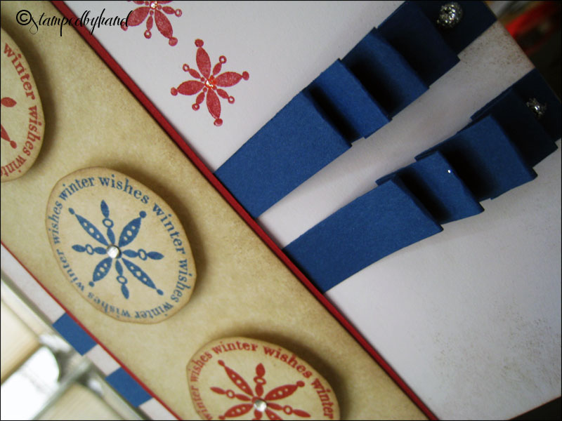
I elected to keep this one simple using the layout from  Heart 2 Heart Close To My Heart Challenge Blog. The technique featured here is paper ribbons; I fold them to get a neat accordion effect and I put a dollop of CTMH's silver sparkle gel to make it look like brads. The circles are raised up and I added a rhinestone to the middle of each. CTMH's Art Philosophy cartridge has a corresponding shape to the circles from the set December 25, but I'm hoping for a Cricut for Xmas and thus they were hand-cut.


The biggest challenge for me was to keep it to cardstock and stamps. It was a self imposed challenge to see if I could break away from the dependency on pattern cardstock. I wanted to showcase the different layers here, and the blue border was punched with a EK snowflake edger punch from Michael's. This one was from Random Acts of Creativity 's template, but instead of a big bow I opted for a tiny green tie.


I dressed up the red piece with a Merry Christmas sentiment. Using the layout from Mojo Monday - MOJO214 instead of a flower I stacked three different ornaments from the set Holiday Cheer.with mounting foam tape. It's a bit slimmer than the usual foam squares. And finally, to highlight the snow I used Liquid Applique to outline the roofs and snow in the trees, then embossed it for a poofy look.


This last one from SplitcoastStampers.com highlights one of the major perks about working with acrylic stamps: you can bend them (but be gentle!) to follow curves and other funky shapes depending on what you're stamping on. I again lifted up the three ornaments from the set December 25 and curved the love-hope-peace sentiment from Snow Flurries. The blue snowflake that was cut out again by hand is better done with the corresponding shape in the Art Philosophy Cartridge.

I hope these four cards are charming enough to bring in some $$ for Ryan's Well - wish my friend luck!

Michaels:
* Mounting foam tape
* Cardstock from 'Spice Market'
* Cardstock from 'Gems'
* Cardstock from 'Primary"
* Rhinestones

CTMH:
* Snowflakes
* You and Me
* A Sip
* Pair A Phrase
* Festive Thoughts
* Holiday Cheer
* Snow Days
* December 25th
* Snow Flurries
* Silver Glitter Gel
* Liquid Applique
* Chocolate Ink
* Cranberry Ink
* Moonstruck Ink
* Ponderosa Pine Ink
* Olive Ink


Sunday, November 6, 2011

You and Me Themed 2012 Calendar

This was a unique challenge for me. I wanted to stay solely with the colors that were in the You and Me Kit: Creme Brulee, Olive, Smoothie, Garden Green, and Chocolate which meant that I did not have free reign with colors like I normally have. However, I didn't mind; it was actually less stressful to work with four colors (I did not end up purchasing the Creme Brulee ink) and it came out looking fantastic.


As you can see I ended up using You and Me patterned cardstock for the front and back only. The rest of the inside pages were the brownish/cream colored cardstock from Michael's Spice Market cardstock and the quote pages were white cardstock that I distressed with chocolate ink.


Each of the stamped corners on both sides were done with the curly stamp from You and Me, three times per corner and then all squares were distressed with chocolate ink. I thought it would be lovely to have a little quotation on the back of each square. Each quotation is matched with some "pictures" of course, all second generation stamping. In the case of September and December, the months actually span over six weeks so I needed to do some masking in order to stretch the weeks.

I wish I could keep this calendar for myself as it came out looking so gorgeous but it is a present that I'm sure my Mom will love this year for Christmas. I am glad that this project is done - I can finally put all my stuff away properly :) but no shortage of stamp sets were used.

All in all this being my first time, I will definetly use the My Creations chipboard items again. Next time I will be using their triangle banner.

Michaels:
* Cardstock from 'Spice Market' set

CTMH:
* You and Me Kit
* Creme Brulee, Smoothie, Olive, Garden Green cardstock from Autumn set
* Bohemian Alphabet
* Classmate Alphabet
* Month By Month
* Enjoy Life
* Find Your Style - Jan 2011 Stamp of the Month
* Horizons
* Chairs To You - April 2011 Stamp of the Month
* Pair-A-Phrase - August Constant Campaign
* Angel Sent
* Sensational Season - March 2011 Stamp of the Month
* Wings Workshop kit stamp - retired
* Dreams Come True
* Baby Love
* Snowflakes
* Wonderful Friend - retired
* Olive Ink
* Chocolate Ink
* Garden Green Ink
* Sorbet Ink

Friday, September 30, 2011

The best holiday of the year...

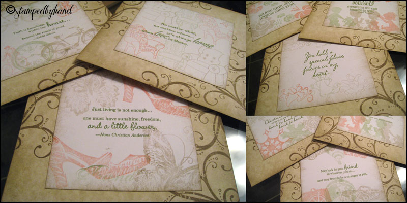
This is the last few hours to get in on the Pair A Phrase deal! It's CTMH's first time selling a double stamp set in one envelope, and this one in particular is so versatile. I also noticed a card in CTMH's Facebook Group (the group's official name is Close To My Heart) and just had to use it for inspiration. It's found in their My Acrylix® Pair a Phrase Inspiration photo album and looks like this:
I don't own the spray pens yet or the pearl paint or reinkers; however, that's what they used to achieve that neat "spritzed" effect on the upper left hand corner. My take on this card using a similar color scheme:


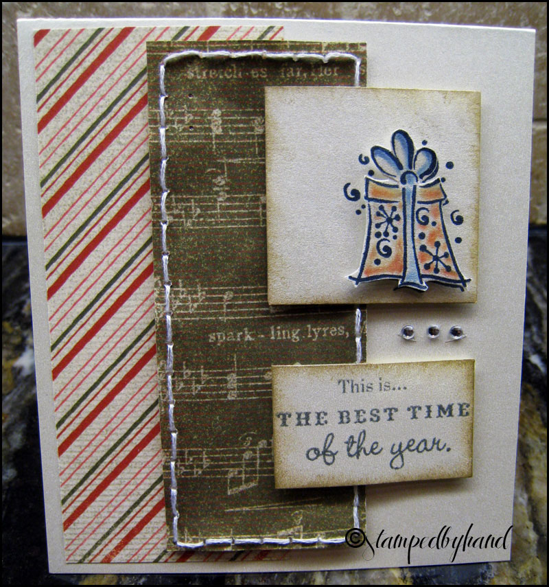
As you can see, I also distressed the edges in Desert Sand and colored my present somewhat similar. However, I added some rhinestones and some awesome patterened paper from Mistletoe's Level 2 Paper Pack (retired). This was also my first time stitching on paper and it was so easy! Using CTMH's new ruler with the holes and their piercing kit it looks pretty even. The embroidery floss is from the days I was obsessed with cross-stitch. I colored the present which is raised up with a blending pen.


Instead of using a blended pen this time, I actually decided to break out my old box of pencil crayons. There is definetly some merit to being a bit of a saver when it comes to anything crafty. It brought back memories... and the sentiment is from Festive Thoughts (retired).

Michaels:
* White cardstock from 'Gems' set
* Rhinestones

CTMH:
* Pair-A-Phrase (last day of promotional item)
* Festive Thoughts (retired)
* Mistletoe paper pack Level 2 (retired)
* Piercing Kit
* Ruler
* Grey Wool Ink
* Cranberry Ink
* Spring Iris Ink
* Desert Sand Ink

Have a great weekend!